
How We Rebuilt the Testicular Cancer Foundation Website in Three Days (And Why It Matters)
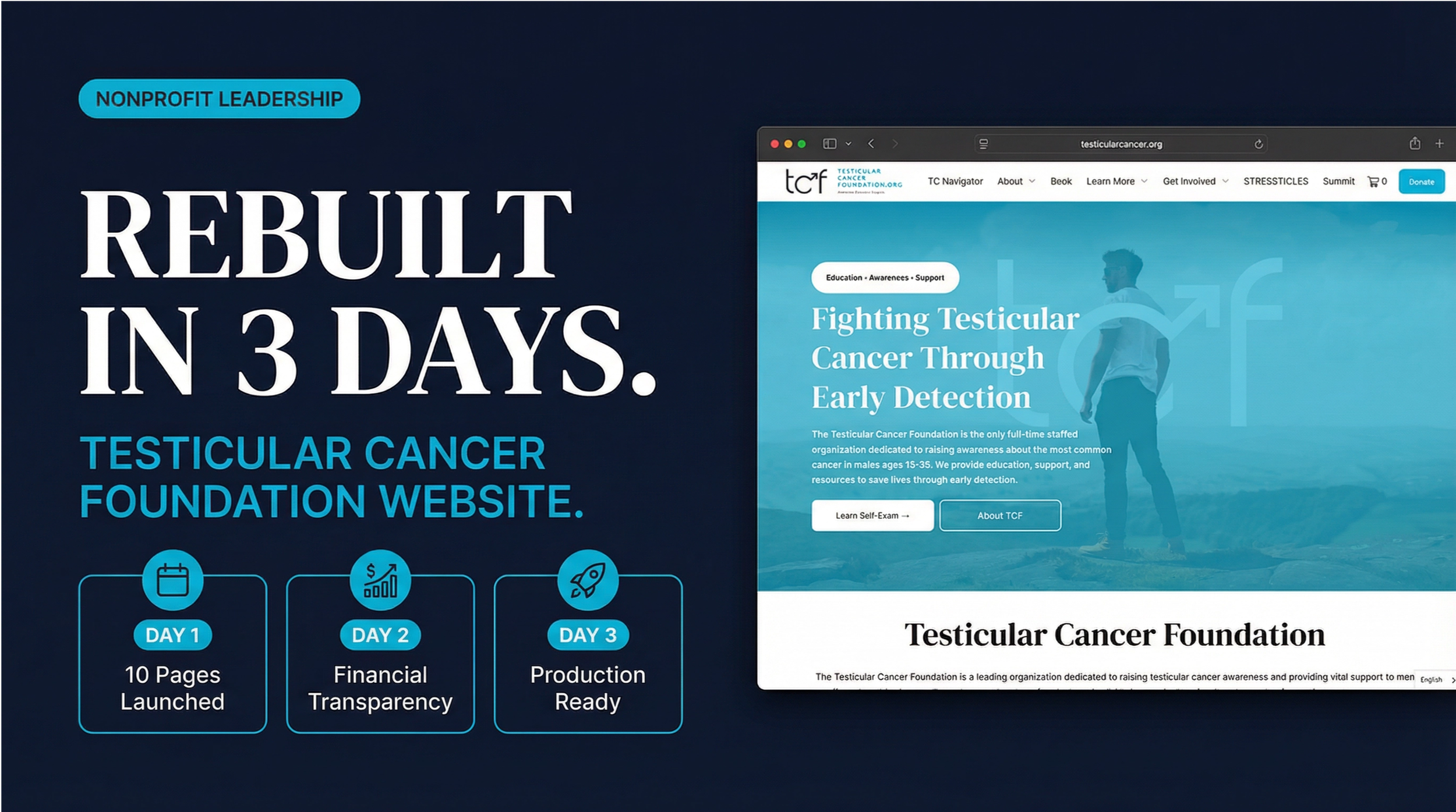
On December 30th, I started working on what would become a complete rebuild of the Testicular Cancer Foundation's website. By January 16th, we had launched a production-ready platform with 10 core pages, full financial transparency, and an educational architecture designed to actually save lives.
Total active build time: three days.
This is what happens when you treat a nonprofit website as public health infrastructure instead of marketing collateral.
The Problem We Were Actually Solving
TCF's previous website had all the classic symptoms of legacy nonprofit digital presence: fragmented content with no clear hierarchy, navigation built around internal org charts instead of user needs, financial transparency buried in compliance pages, and search visibility for critical health information that was basically nonexistent.
But here's what mattered most: the site wasn't functioning as an educational and awareness engine for testicular cancer. For an organization operating in public health, that's not just a UX problem. It's a mission failure.
The practical consequences were real: missed opportunities for early detection education, diluted authority when people needed reliable information, and unnecessary friction for patients, survivors, and supporters.
Architecture First, Aesthetics Later
The first decision was to ignore what the site looked like and focus entirely on what it needed to do.
I restructured everything around user intent, not organizational convenience:
- Education
- Detection
- Community
- Transparency
- Engagement
This sounds simple, but it required killing dozens of pages that existed because someone once thought they should, not because anyone actually needed them.
Day One: The Foundation Build
In the first active workday, we shipped a complete website foundation. Not wireframes. Not prototypes. Production-ready pages:
- A homepage that immediately surfaced education and action paths
- A step-by-step Testicular Self-Exam guide, because this is literally why we exist
- An About page with actual leadership context, values, and organizational history
- An Events page featuring the TCF Summit
- A Cojone Club survivor network page
- Contact and Donate functionality
- A custom 404 experience
- Fully responsive navigation and footer
Every page was real, complete, and useful from day one.
Transparency as a Feature, Not Compliance
Here's where we did something most nonprofits won't: we built financial transparency into the information architecture as first-class content.
A dedicated Financials page includes full organizational and legal details, a downloadable IRS determination letter, a complete Form 990 archive from 2012 to 2023, and a plain-language explanation of why transparency matters.
Most nonprofits treat financial disclosure like a legal requirement to minimize. We treated it like a trust signal to maximize. Because in 2026, if you're asking people for money to fight cancer, hiding your 990s in a footer link isn't just bad UX. It's disrespectful.
Building for How Information Actually Spreads Now
One of the biggest strategic bets was implementing a hub-and-spoke education model.
Central Hub: Testicular Cancer Awareness
Supporting Spokes: Awareness Month, Education Programs, Early Detection, Statistics and Facts, How to Raise Awareness.
This structure does two critical things. First, it allows each page to stand alone as a complete resource while reinforcing the authority of the entire system. Second, it's designed for how both humans and AI-driven search actually work in 2026.
Google isn't the only game anymore. People are asking ChatGPT, Claude, and Perplexity for health information. If your content isn't structured for AI retrieval, you're invisible to an increasingly large portion of your potential audience.
Design System: Medical Modernism
The visual approach prioritized calm and clarity: clean layouts with intentional whitespace, strong typography, and warm accent colors. The goal was to reduce anxiety and friction for people seeking health information, not to win design awards.
What Three Days of Focused Work Actually Produced
Here's what shipped: 10 production-ready pages, 5 reusable components, 8 custom visual assets, 100-plus pages of wireframe and system documentation, SEO-ready architecture, and a scalable content foundation. Roughly 10,000 lines of code and 20,000 words of documentation. Zero reliance on external agencies. Zero budget beyond infrastructure costs.
The tech stack was intentionally modern but not exotic: React 19, Tailwind CSS 4, shadcn/ui, static frontend architecture, and WCAG 2.1 AA accessibility considerations.
Why Speed Matters (And Doesn't)
Three days is fast, but speed was a byproduct, not the goal. When you know exactly what you're building and why, when you're not designing by committee or waiting on stakeholder review cycles, when you have modern tools and real technical fluency, things move quickly.
What made that possible was years of organizational understanding, content foundations, and systems thinking built before a single line of code was written.
What This Actually Changed
The obvious wins: clear educational pathways for early detection, improved authority signals for search and AI systems, simplified navigation aligned with user needs, and transparent financial disclosure as a trust feature rather than a buried compliance page.
The website now functions as public health infrastructure rather than a brochure. It supports future awareness campaigns, scales for speakers and events and educational resources, and reduces friction for content expansion.
Early Results: The Numbers That Matter
In the weeks following launch, the site reached 37,400 people and logged 54,600 page views, with an average time on site of 1 minute and 46 seconds.
But the more telling data is which pages people are actually reading. The top-performing pages aren't the homepage or the about page. They're the symptom guides: the right testicle pain page leads all traffic with 3,000 entries and an average read time of over 7 minutes. Left testicle pain, the self-exam guide, and the pea-sized lump guide round out the top five.
Seven minutes is a long time to spend on a health article. That's not a casual scroll. Those are people sitting with information they needed, probably worried, working through something difficult. The site is doing exactly what it was built to do.
A few other signals worth noting: the TC Navigator AI agent is logging consistent use, Spanish-language visitors are finding the site organically without any dedicated outreach, and organic keywords are up 534% year over year. The digital infrastructure is working, and it's compounding.
What Comes Next
With the foundation complete, TCF is positioned to expand in ways that weren't possible before: full awareness spoke pages with deep educational content, downloadable resources for patients and families and healthcare providers, expanded speaker and event ecosystems, structured data and AI visibility optimization, and multilingual education initiatives.
The rebuild created a foundation to build from, not a finish line.
The Bigger Lesson
For most of my career in the nonprofit world, a project like this would have required an agency. You'd spend three to six months in discovery, another few months in design reviews, and by the time the site launched, the strategic thinking that started the whole process would already be outdated. And you'd have a bill for $50,000 to $150,000 to show for it.
That's not a knock on agencies. It's just the reality of how nonprofits have had to operate. Most organizations don't have in-house technical capacity. They depend on external partners for anything beyond basic content updates. That dependency has shaped everything: timelines, budgets, the ability to respond quickly to opportunities, and frankly, the ambition of what nonprofits even try to build.
Part of what made that dependency so sticky was how specialized the skill stack used to be. You needed a strategist, a designer, a developer, a copywriter, and a project manager just to ship a website. Those were genuinely distinct disciplines that took years to develop, and almost no one at a small nonprofit had all of them. So you outsourced, and you waited, and you paid for the coordination overhead between people who didn't share your context.
AI tools have collapsed that stack. Not eliminated the underlying skills, but collapsed the distance between them. Someone who understands the mission and can think clearly about user needs can now move fluidly across strategy, content, design, and implementation in a way that simply wasn't possible before. The judgment still has to come from someone who knows the organization. The architecture decisions, the content priorities, the user empathy — none of that is automated. But the execution layer no longer requires a roster of specialists.
What took a team six months now takes a founder or an executive director a few focused days, if they're willing to learn the tools and do the work. That's not hyperbole. That's what happened here.
For nonprofits operating on thin margins with small teams and urgent missions, that shift matters. You no longer have to choose between moving fast and building something real. You don't have to wait for budget cycles or RFP processes or agency availability. You can build infrastructure that actually serves your mission, on your timeline, with your own hands.
That's worth paying attention to.
The Testicular Cancer Foundation is a national nonprofit focused on education, awareness, survivorship, and early detection of testicular cancer. Explore the rebuilt website at testicularcancer.org.